


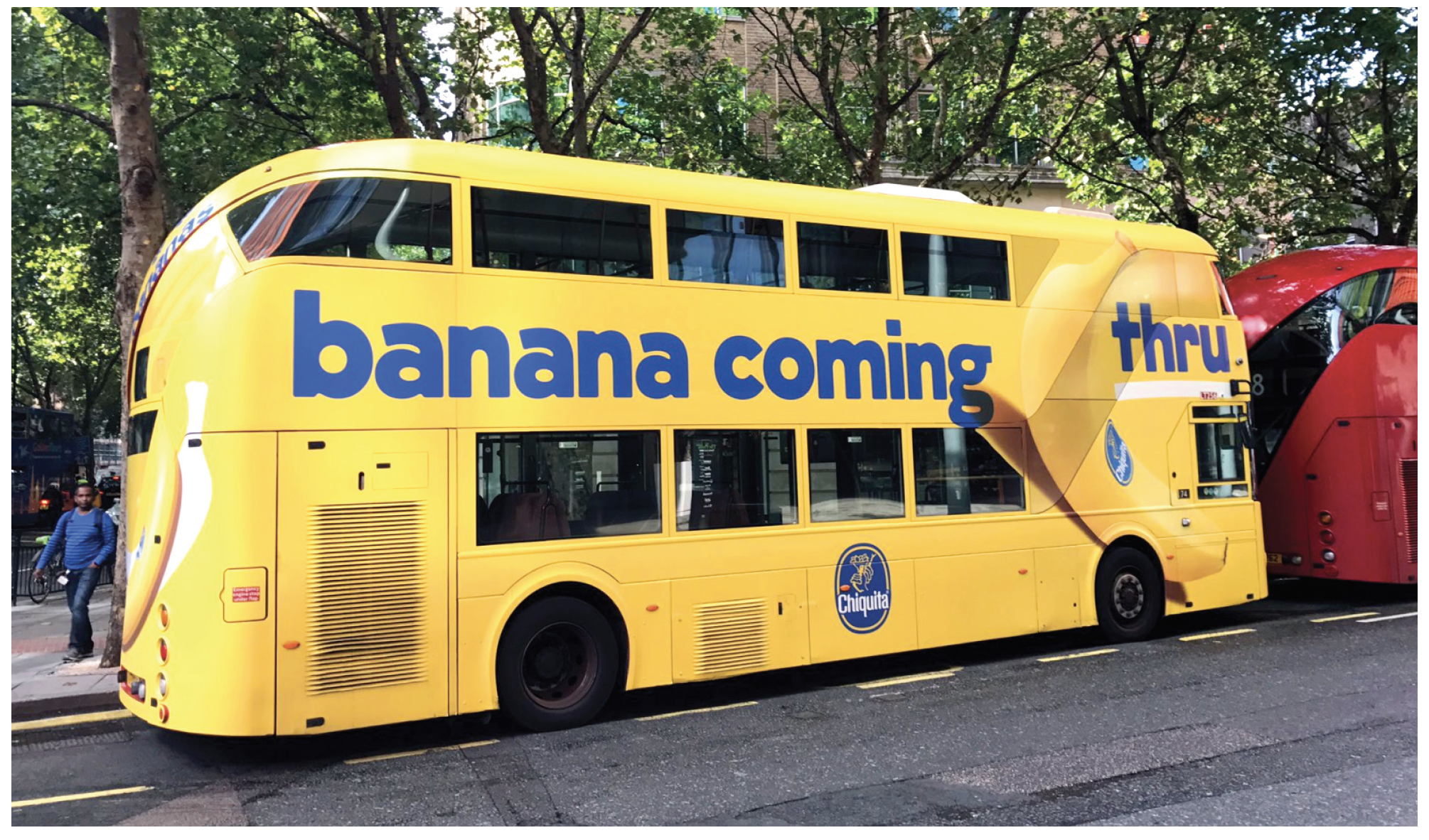


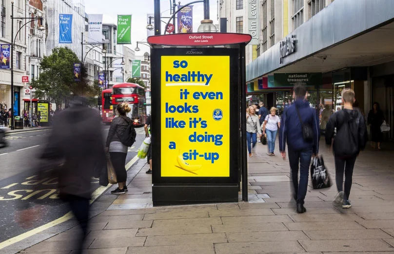


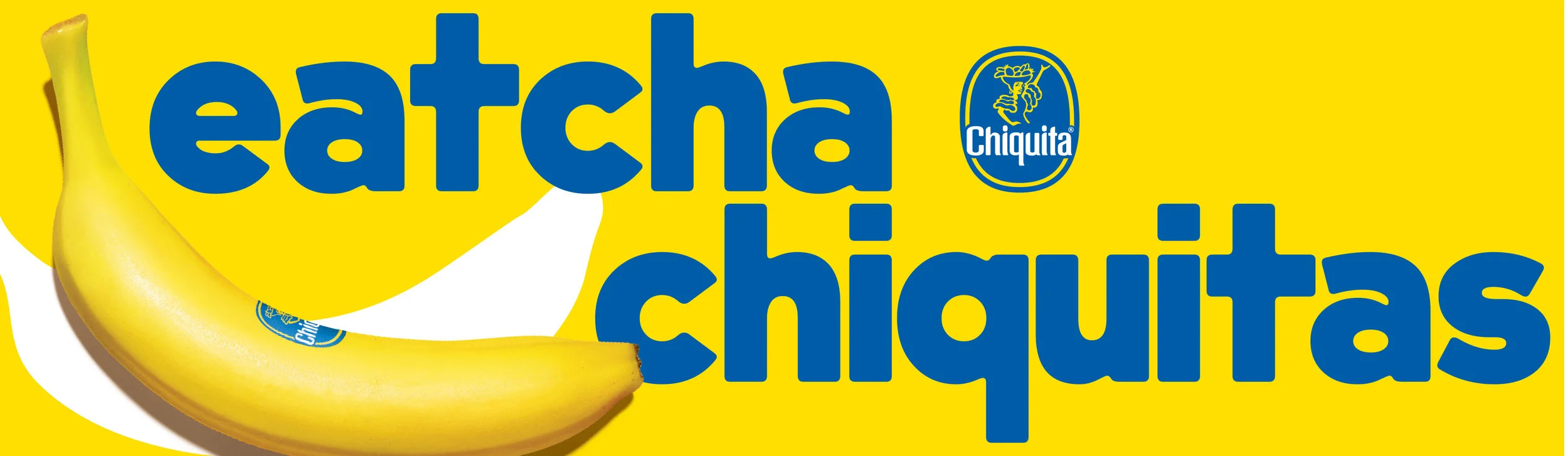

After years of lying dormant, we re-launched a new Chiquita brand identity in the U.S. and abroad. Our intention was to show that Chiquita Bananas are playful, iconic, eye-catching, bold, optimistic, healthy, delicious and most importantly fun.
We defined a new typeface, tone of voice, photography style, and graphic elements to make every piece of communication about bananas a little bit more fun.
Client: Chiquita
Agency: W+K Portland
Account Executive: David Newsome
Creative/Design Lead: Mike Weihs, Mike Egan
Creative Manager: Simone Takasaki
Copywriting: Kate Digilio, Becca Wadlinger, Emma Dou
Designers: Julia Perry, Dee Mahon