KFC: Global Brand Standards
Company
KFC
Year
Deliverables
Identity
Motion Design
Brand Standards
Team
Overview
KFC’s global refresh brought its most recognizable assets into a clearer, more flexible identity. I worked on the logo system, including the Colonel, wordmark, and key lockups, and created the motion work that brought it to life.
Logo system
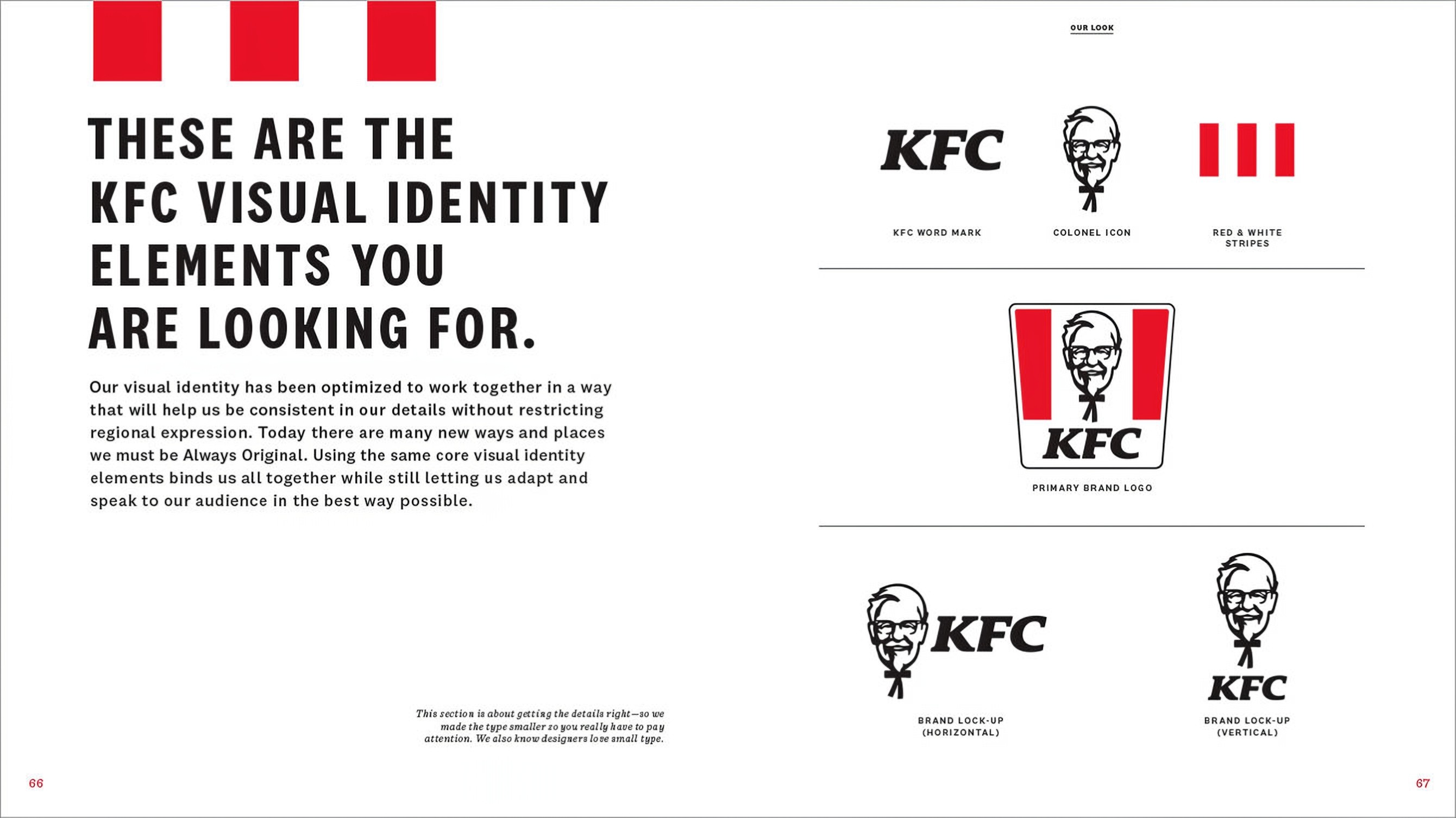
The primary logo combines the Colonel, KFC wordmark, and red-and-white stripes in a shape inspired by the bucket. Its components can also work independently, giving the identity flexibility without losing recognition.
The wordmark


Identity refinement
The wordmark became rounder and more approachable while retaining its familiar character. The Colonel was redrawn to face forward, with his right ear made visible, a subtle change that gives the portrait greater balance.
The Colonel


The stripes
System at work
The brand, in motion
Brand standards
The brand standards document how the refreshed Colonel, wordmark, stripes, and lockups work together. Clear rules help teams adapt the identity across formats and markets while keeping it unmistakably KFC.